
May ’26
Sweet Spot
food delivery, restaurant
branding · web design
Premium without distance
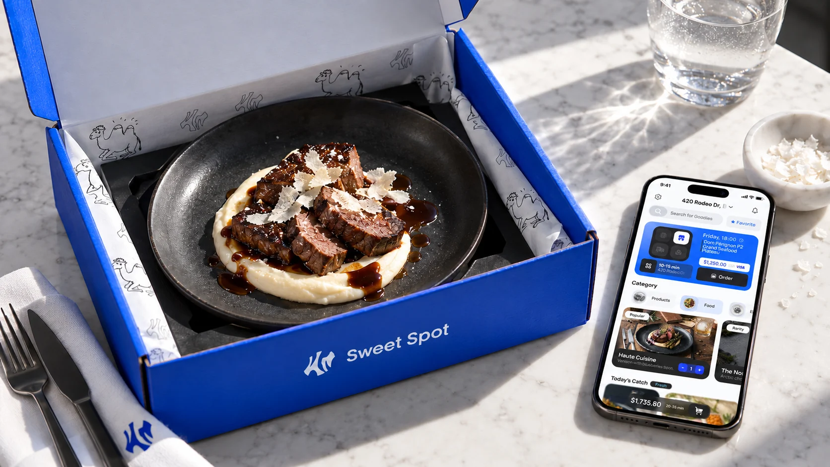
Sweet Spot is a platform concept built around a shorter path to a transaction. The product idea is to remove unnecessary steps and make the service easier to use. The identity reinterprets luxury aesthetics. It stays premium while communicating in an everyday, approachable way. The project does not represent a launched commercial service.
A shorter path to a choice
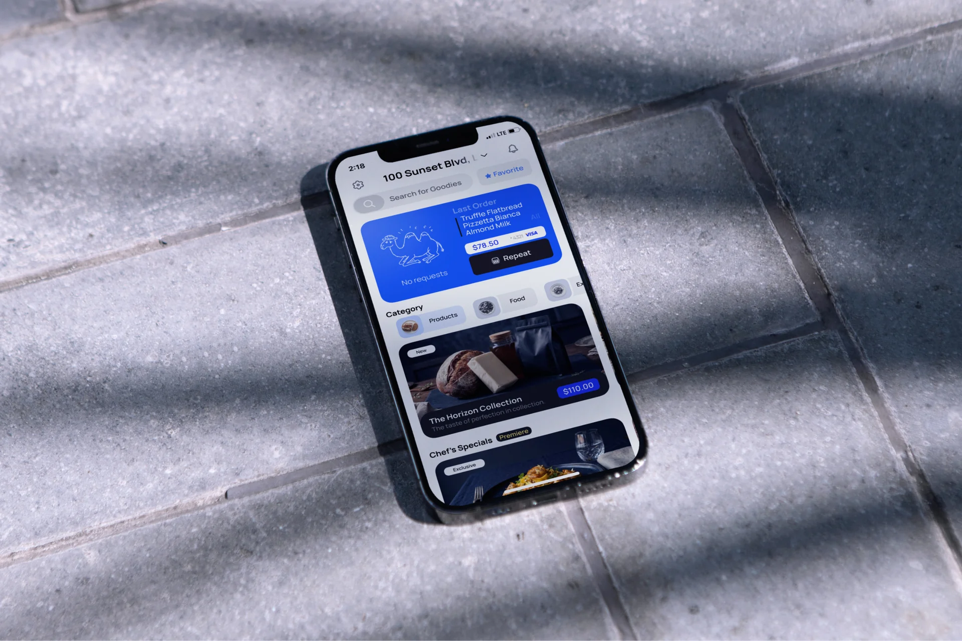
The interface focuses on the offer and the next action. The concept aims to reduce navigation steps and keep product discovery close to selection. A blue accent connects the screen to the identity, while light information areas make room for images and essential details. Product logic guides the design without claims about unverified outcomes.
An everyday character
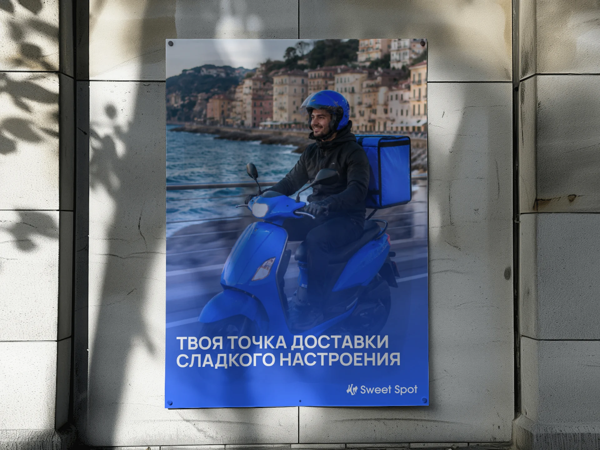
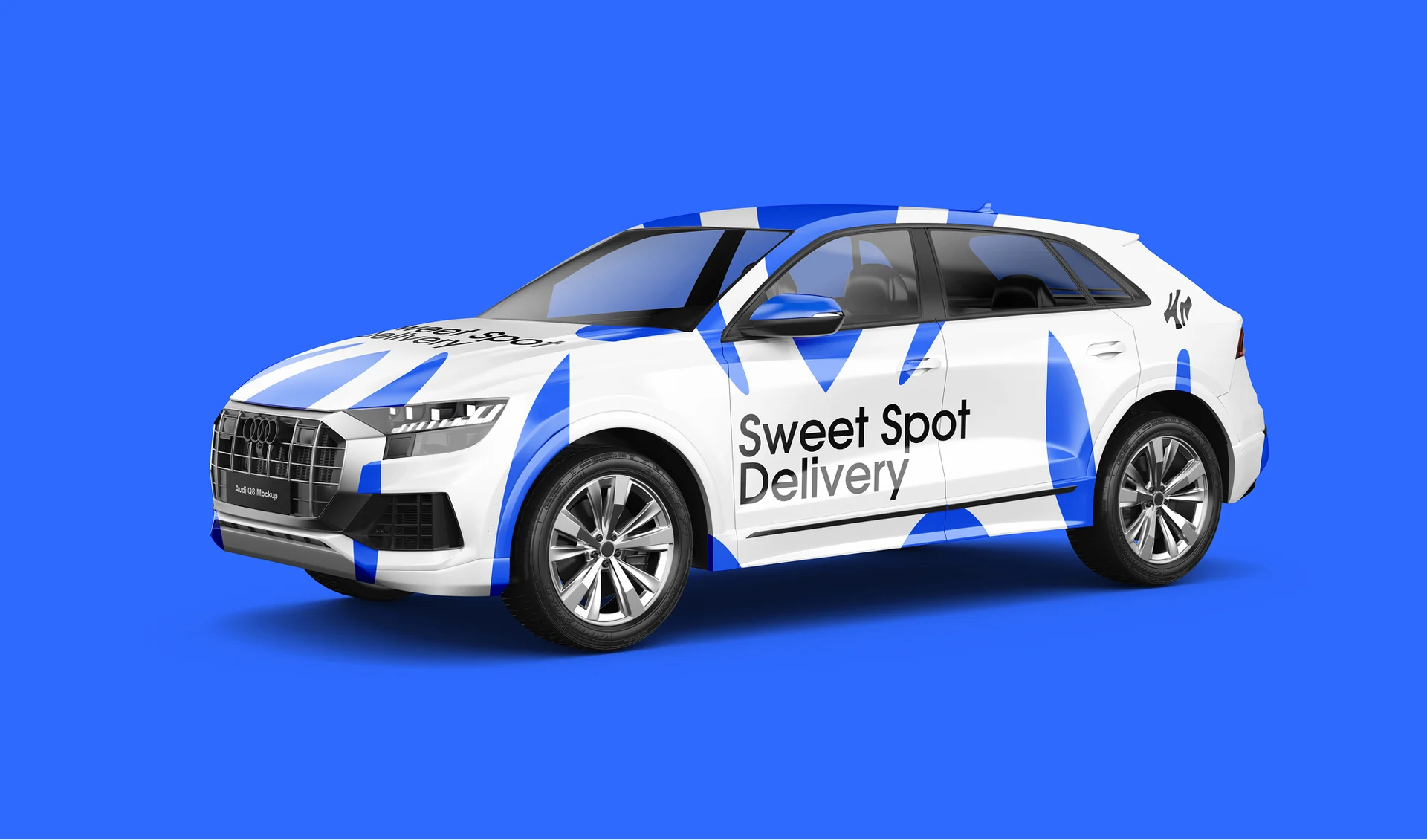
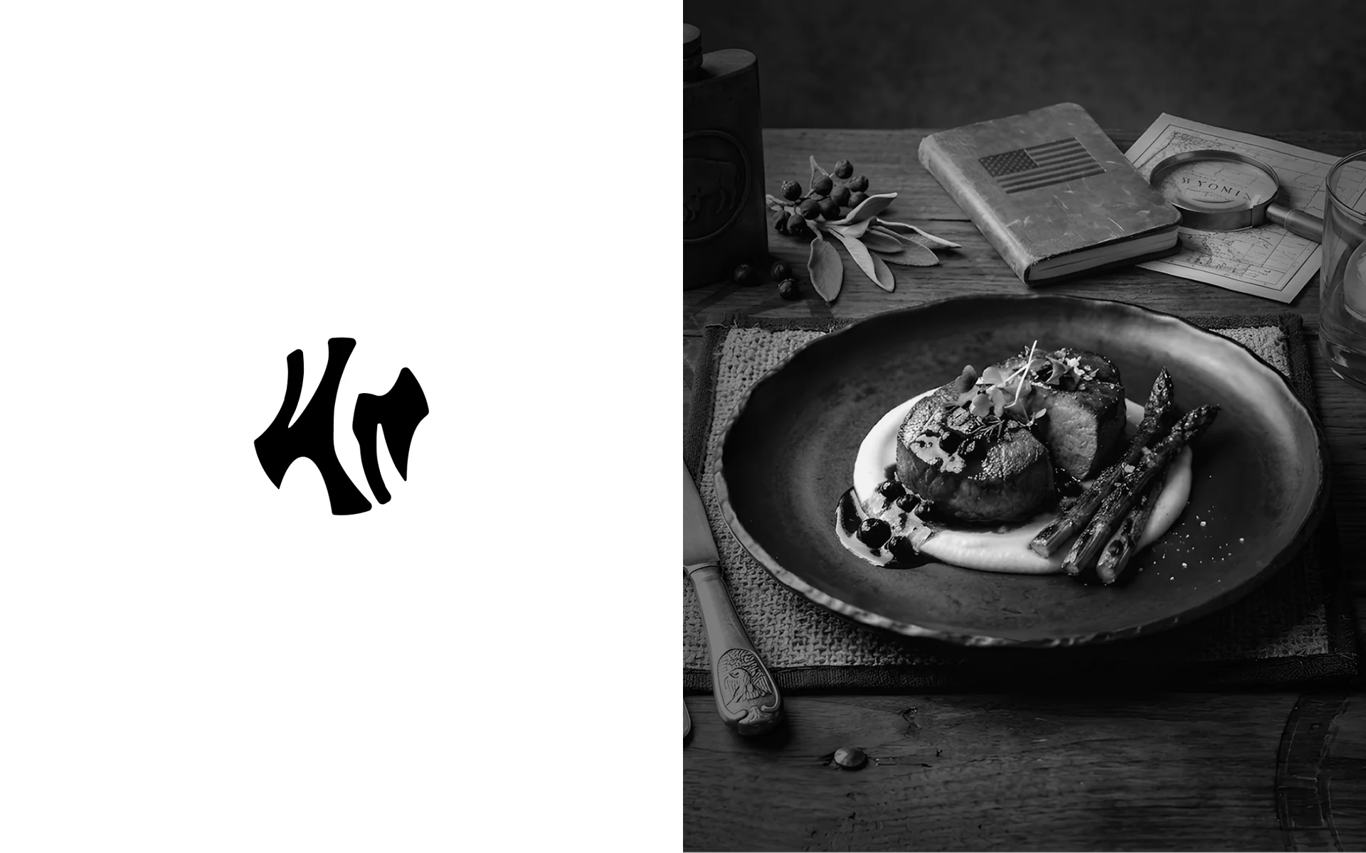
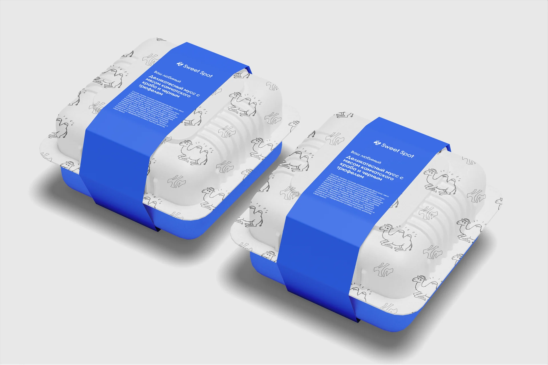
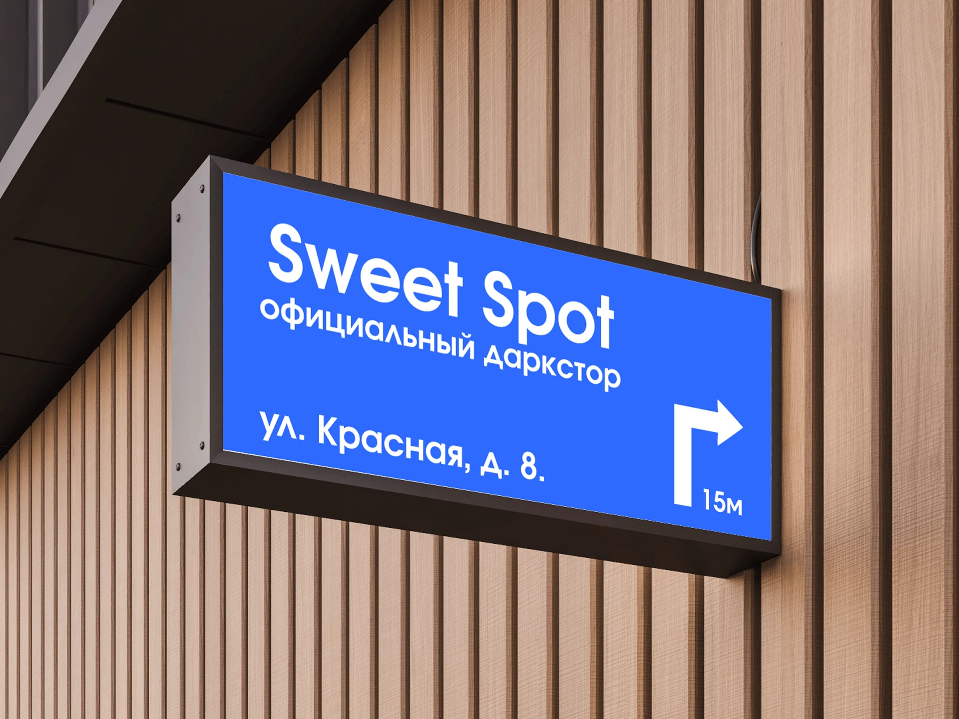
Product photography, simple messages and familiar applications make the premium identity less distant. The visual system extends from the interface to urban settings and packaging, keeping the same mark and saturated blue. Communication avoids making price or exclusivity its main message. It supports ease, clarity and a service that fits into an ordinary day.