
Luwberry
An approachable digital brand
branding · web design
Friendliness as an idea
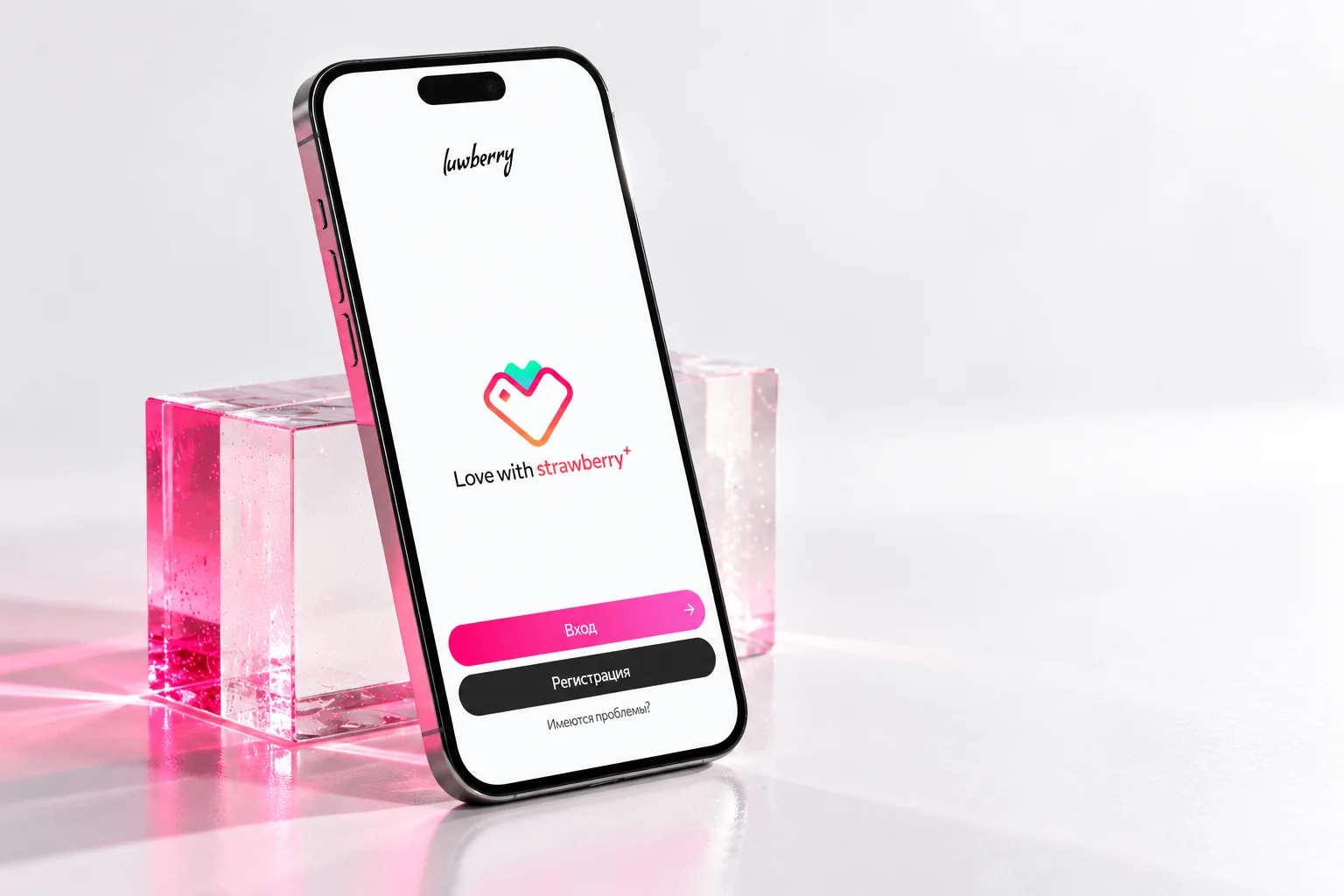
Luwberry is a concept exploring a friendly digital brand. The task is to find a visual language that feels light, warm and emotional, without unnecessary distance between the brand and the person. The concept explores colour, shape, typography and communication. It does not represent a commercial commission or a launched product.
Soft form, expressive colour
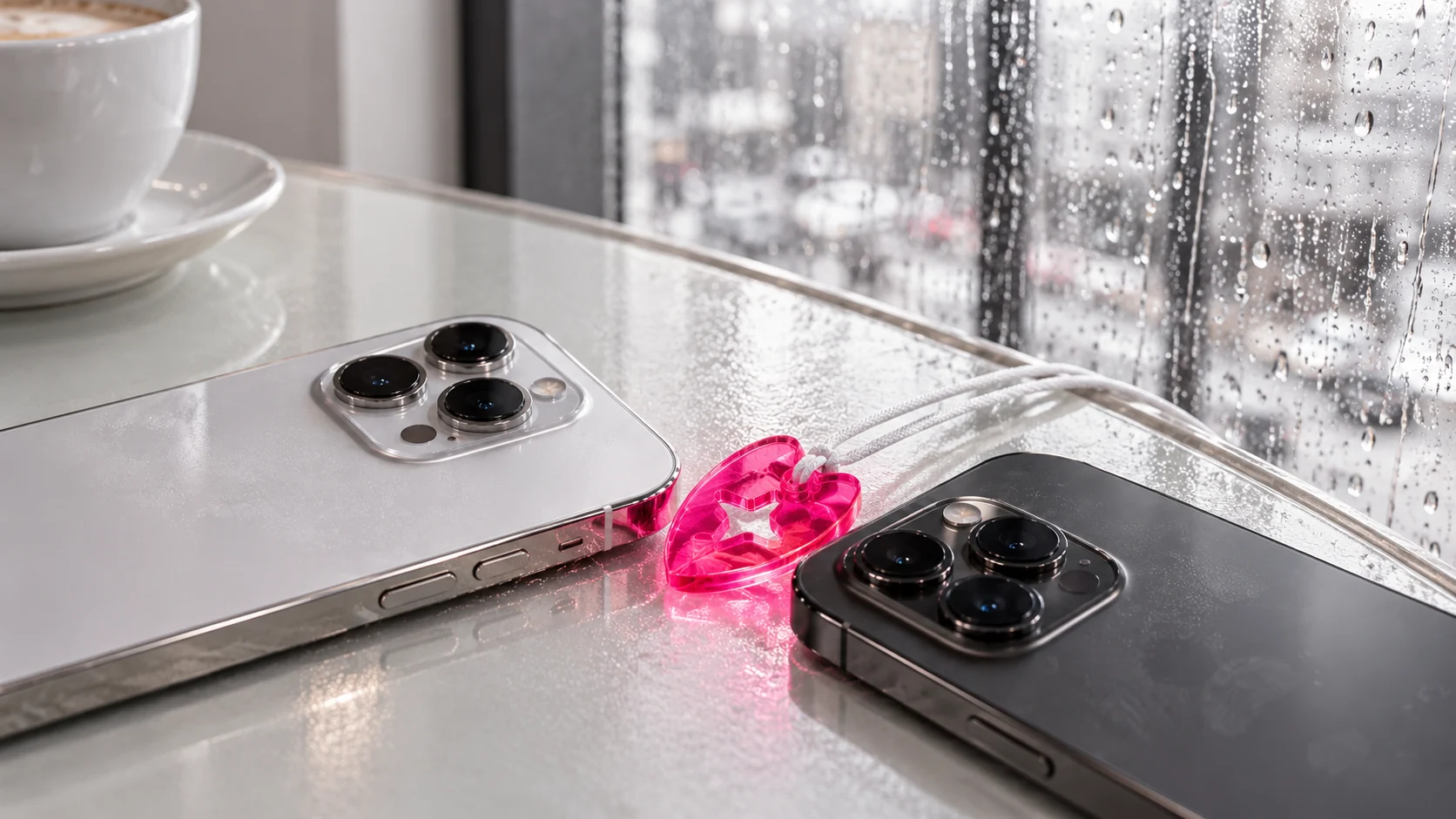
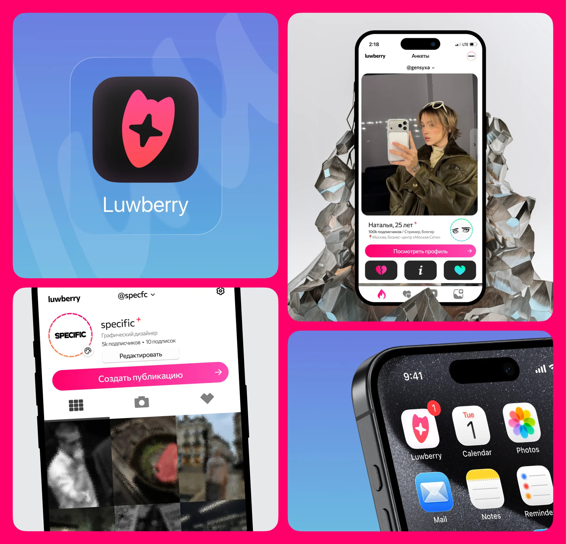
The mark combines a rounded silhouette with a light symbol inside. Vivid pink gives it an emotional tone, while the simple shape works at small and large scales. Light backgrounds and soft product compositions reinforce the friendly character. The identity feels like an invitation to connect rather than a formal corporate system.

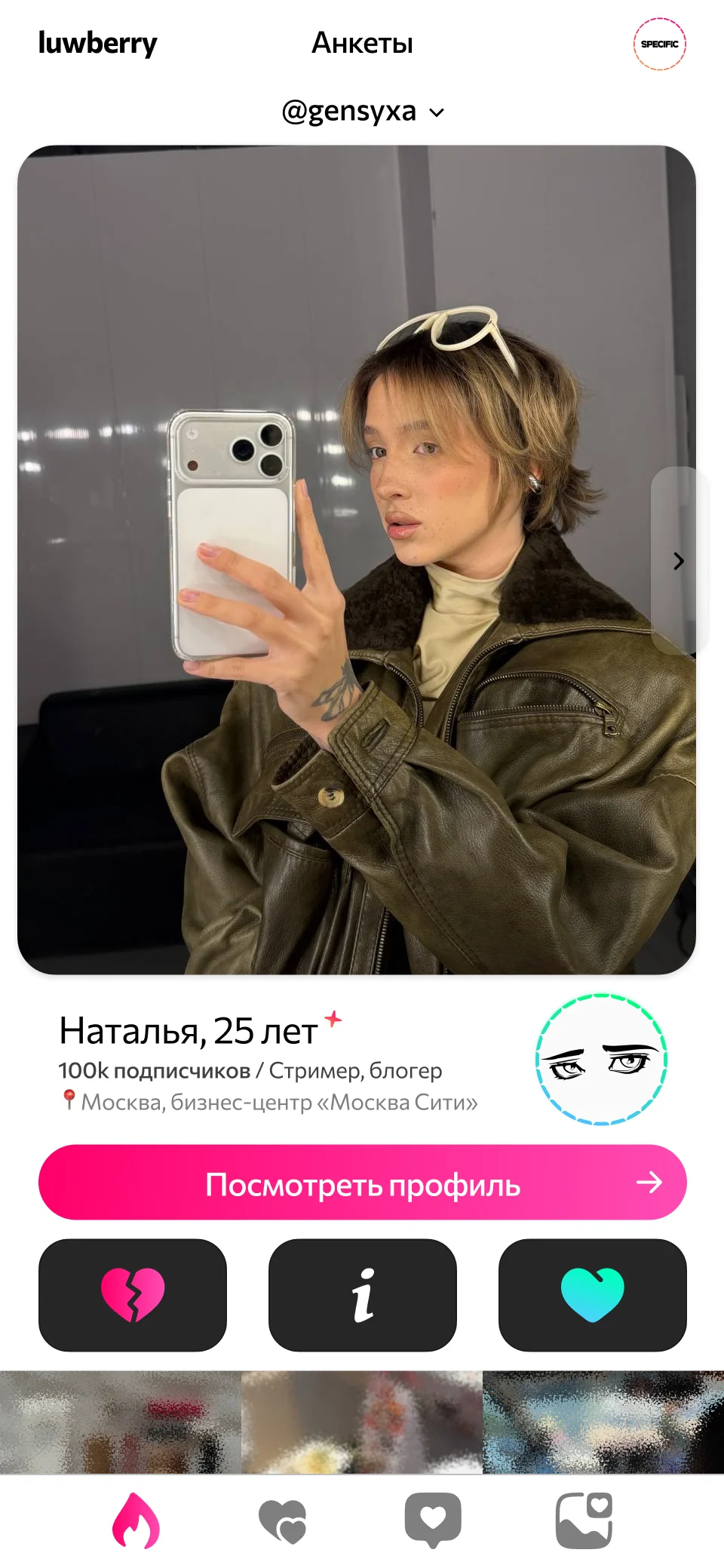
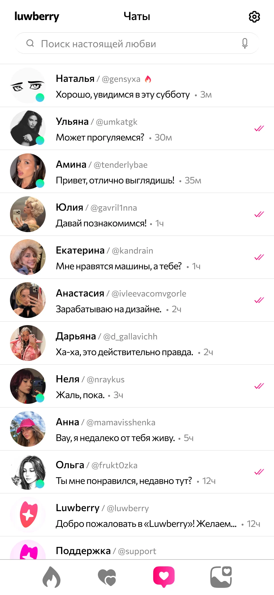
An approachable interface
In the profile and chat concepts, expressive accents sit alongside a simple information structure. Colour highlights actions and small emotional details, while typography makes content easy to scan. The brand extends into everyday interaction through clear elements, comfortable spacing and a recognisable mark.