
July ’26
FLŌRA
premium water
branding · social media
Space for a visual pause
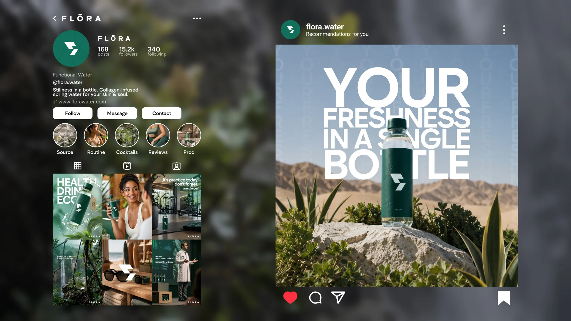
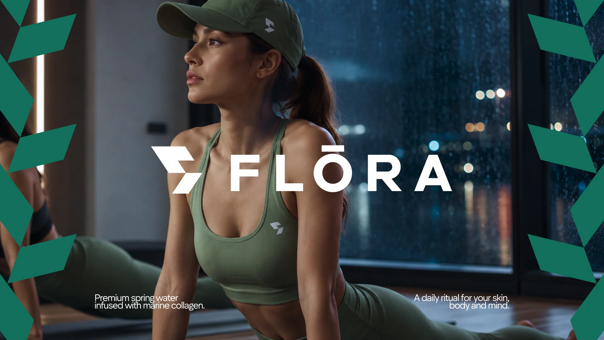
FLŌRA is a calm, eco-minded brand concept. It offers an alternative to overloaded feeds, negative news and a constant stream of content. The identity speaks to people seeking a quieter everyday environment, including those interested in sport and active living. It is a brand concept, not an existing commercial product.
Colour and visual quiet
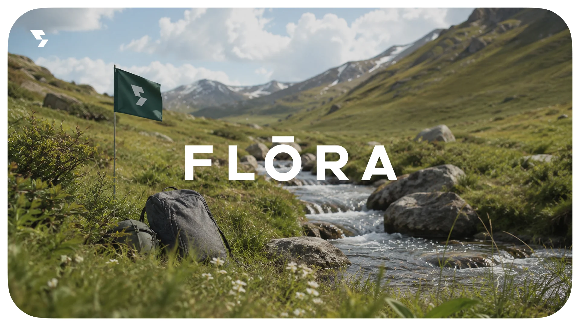
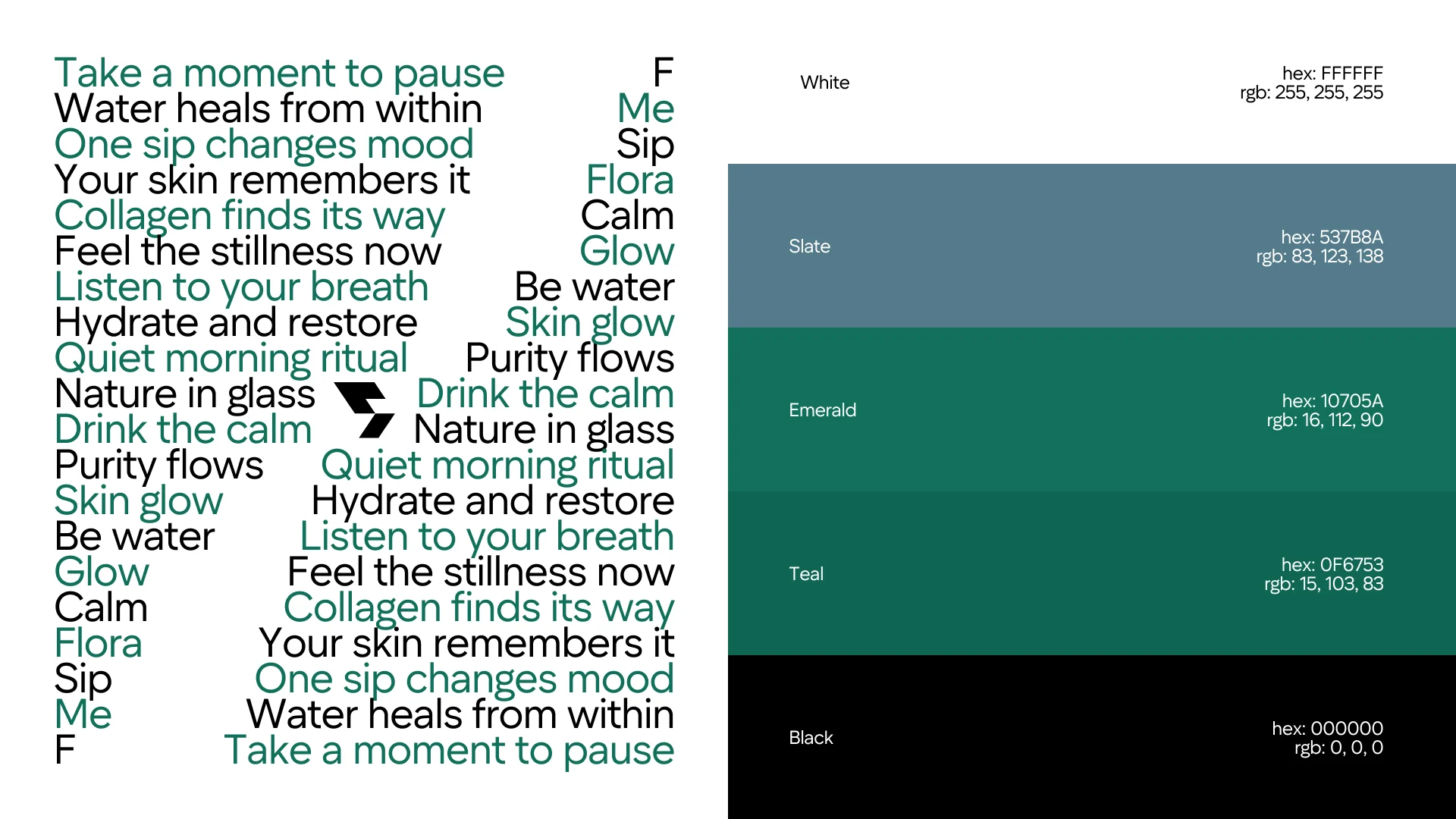
Green and light tones connect the identity to nature, clarity and recovery. Space between type and imagery slows the composition and lets one message take focus. Quiet typography and short phrases support that clarity. Ecology is a direction of the concept, with no unverified claims about a product’s properties.

Nature alongside people
The visual system connects landscapes with people in active everyday settings. Photography brings a sense of presence, while soft graphics and restrained layouts preserve the mood. Posters and smaller applications share the same colours and mark. Gentleness and calm remain recognisable as the format changes.