

August ’26
Street Workout
sports centre
branding · social media
A refreshed sports identity
Street Workout is a redesign of an existing logo and visual identity. The main task was to simplify the mark and make it clearer, easier to recognise and remember. The update extends beyond the logo. Graphics, photography, typography and composition form one system with a shared sporting character.
A mark with fewer details
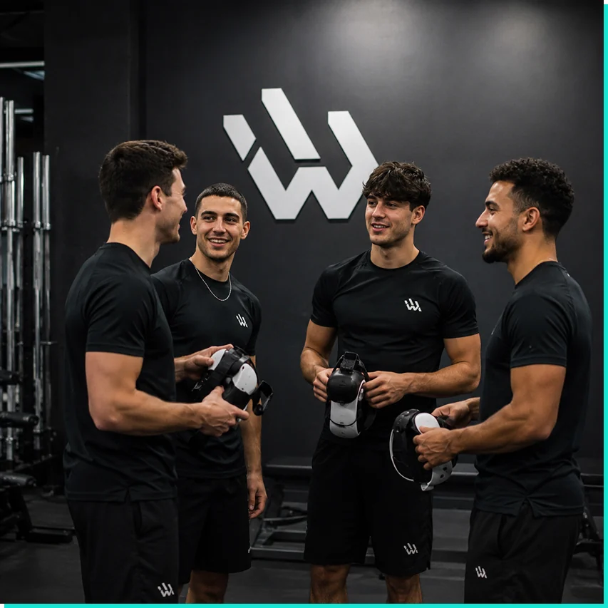
The revised logo focuses on a concise silhouette. It keeps the brand’s energy without relying on a complicated shape for recognition. A large mark in a sporting setting shows the identity alongside people and events. Contrast keeps it legible within a busy composition.
Rhythm and sporting energy
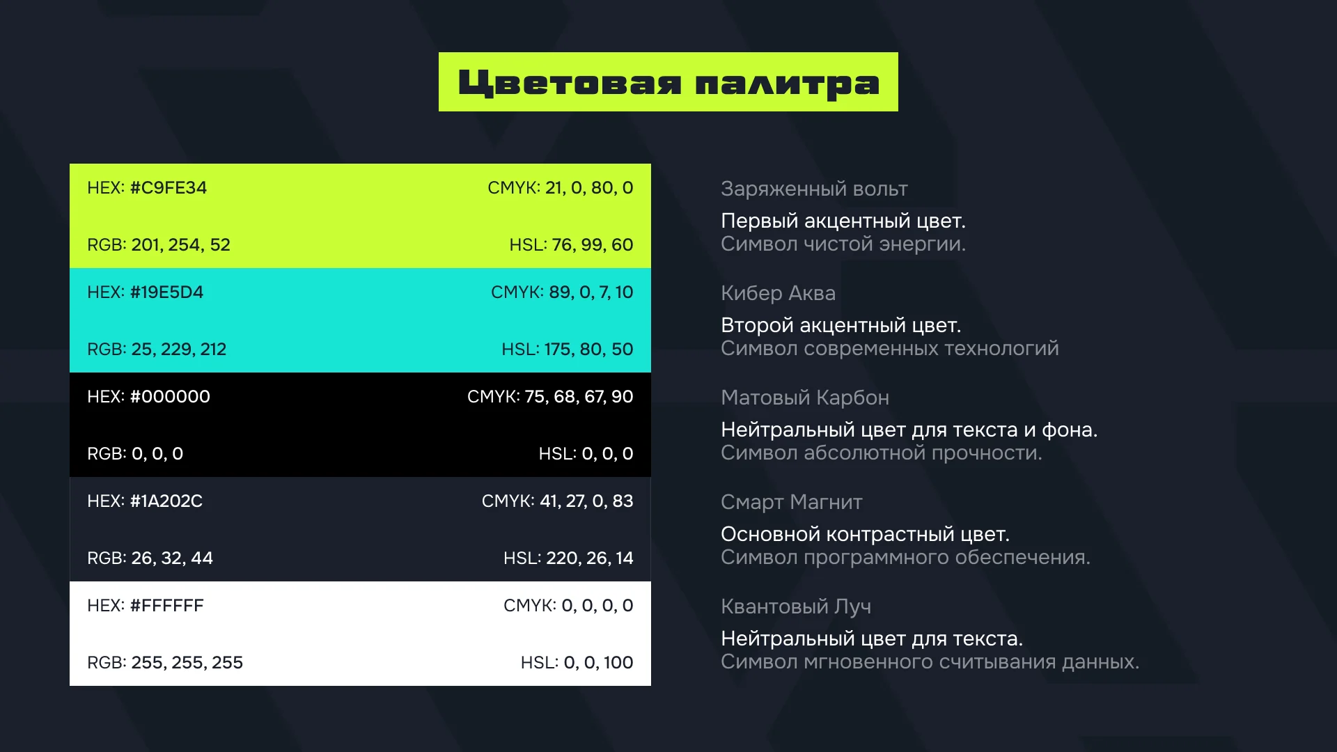
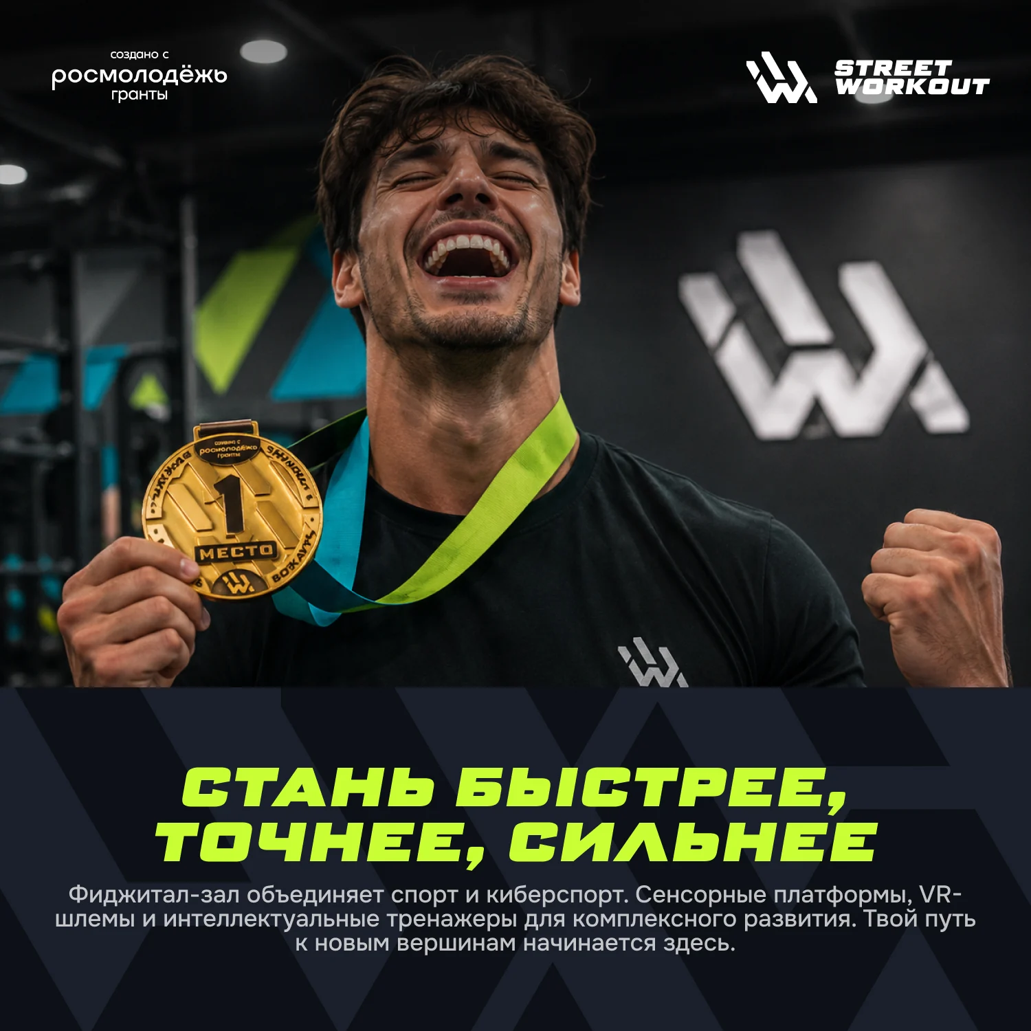
Photography captures movement and effort; graphics turn those images into recognisable communication. Vivid accents, large type and directional lines create rhythm, while a dark base keeps attention on the athlete. Information layouts use the same language. Numbers and short labels become part of the composition and remain connected to the revised mark.

One system, different messages
Legibility and recognition guide the redesign. The logo, promotional layouts and information materials share a common set of visual rules. Content and graphic density can change while the modern sporting character stays consistent.